Pick Your Own Seats
TodayTix | Q2 2018
Overview
The Situation
When I joined TodayTix in 2017, the company was maturing from "the best bargains on Broadway tickets" to "the best way to get tickets to anything." A critical part of this maturation, would be bringing our ticketing products to feature parity with our major competitors. We always knew adding 'seat-picking' would be an important part of that but when we discovered in 2017 that 28.3% of customers were abandoning cart because they couldn't pick their exact seats, we reprioritized our roadmap and our challenge became clear:
Redesign our core booking flows (on both web & iOS) to allow our users to pick their exact seats.
The Role
At the outset of this project I was the only product designer at TodayTix and thus I owned the entire project in it's early phases - collecting and conducting research, facilitating our cross-department ideation workshop, etc. In the design phase I was joined by our new senior product designer Ivan Mutavdzic and we collaborated on everything from that point forward; exploring initial design options, building testable prototypes, conducting usability testing, and synthesizing the results. In May of 2018, I joined the team at ClassPass and thus was not directly involved in the delivery of final designs.
Despite my ownership of these early phases, this project (like every project) would never have materialized without the hard work and collaboration of an amazing team of engineers and product managers.
The Result
Our first round of usability testing delivered a lot of good news about the usability and usefulness of initial designs; there were many tweaks to be made (particularly on mobile) but generally we confirmed that users wanted to pick their seats/sections and could use our prototypes to do so effectively.
Although I was not at TodayTix to see our hard work built and shipped, I did hear from the team that when initially launched in London's Westend, they saw an average 12% increase in MoM bookings for the shows that allowed users to pick their own seats.
Definition
Before I could start designing anything I needed a better understanding of our users, our industry, and the tech that would make this new feature-system possible. To do that, I collected all the past research I could find, filled in the gaps with new research, and synthesized my findings into concrete design goals.
Past Research
Much of the discovery work on the need for seat-picking had been done by our London team prior to my arrival at TodayTix. This included focus groups with 57 theatergoers in London, partner interviews with four theaters in the Westend, and a collection of surveys (with over 10,000 responses) including the abandoned-cart survey which brought "pick you own seats" (or PYOS) to the top of our roadmap. Among the most important findings:
-
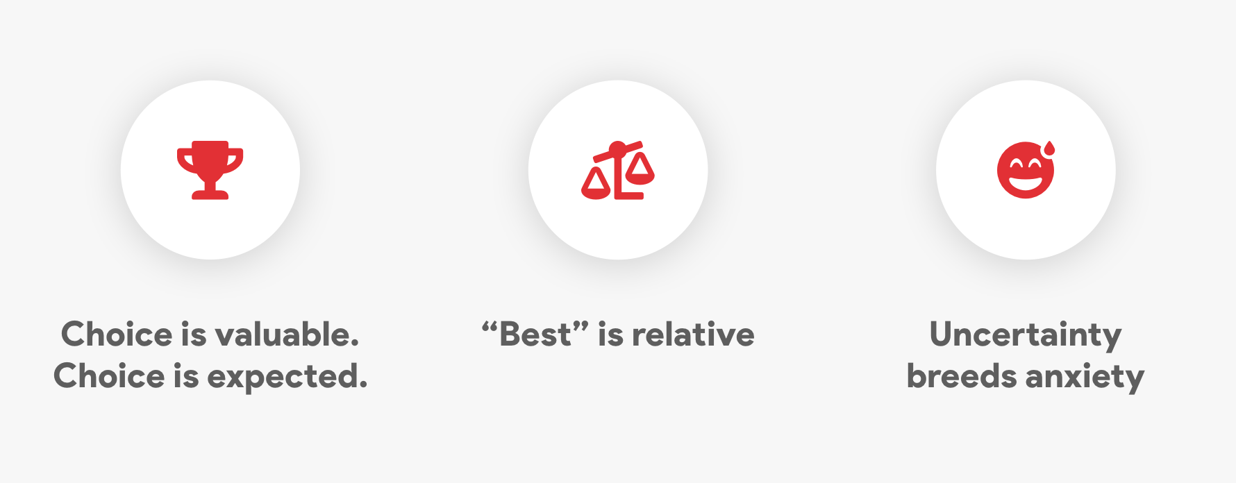
Seat choice is valuable and expected.
Theatergoers will pay more for seats they can choose themselves and a majority expect that they will be able to pick their own seats. -
"Best" is relative.
We all might think we know what seats in the house are "best" but as with airline seating, people want different seats for different reasons. -
Uncertainty breeds anxiety.
For a significant portion of respondents, not knowing precisely where they will be sitting caused anxiety in the purchasing process, after the purchase, and especially on the day of the show.
My Research
Although the past research was immensely valuable, I still had blindspots in my own understanding, particularly where it concerned industry expectations and the technical implementation.
- On the technical implementation, I sat down with engineers and PMs that knew our system best and they brought me up to speed on how our current system works. Beyond these initial meetings, I set up a recurring meeting between design and engineering leadership to discuss implementation and feasibility as we designed and iterated.
- To get a better sense of industry expectations, I conducted stakeholder interviews with six of my colleagues that work directly with our theater partners.
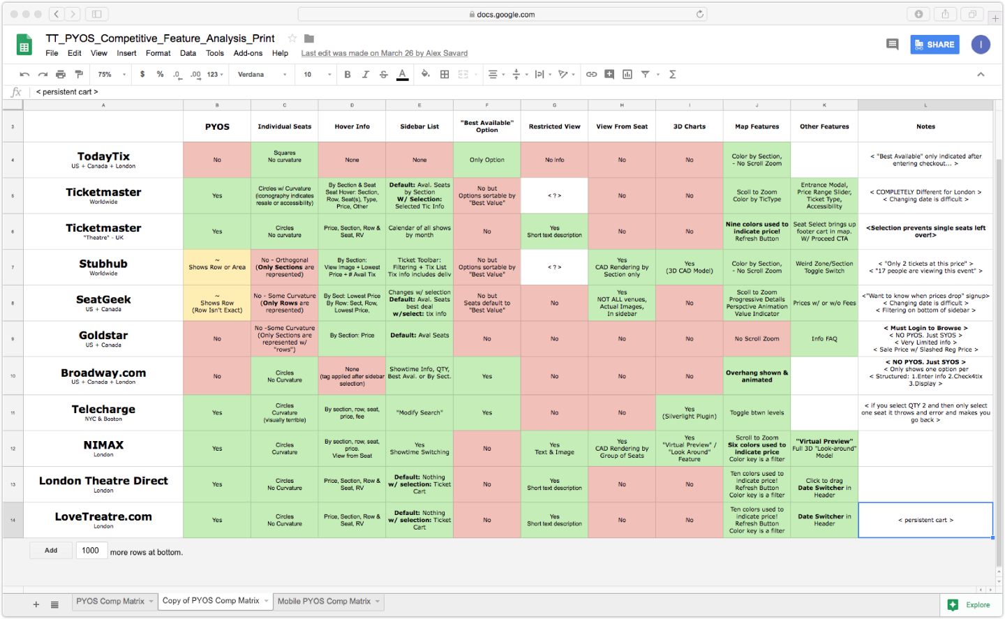
- To get a better sense of user expectations, I conducted a comparative feature analysis on ten other seat-picking platforms. In addition to visually cataloging all these platforms via screenshots from desktop and mobile flows, I identified 16 major features between them and created a comparative matrix.
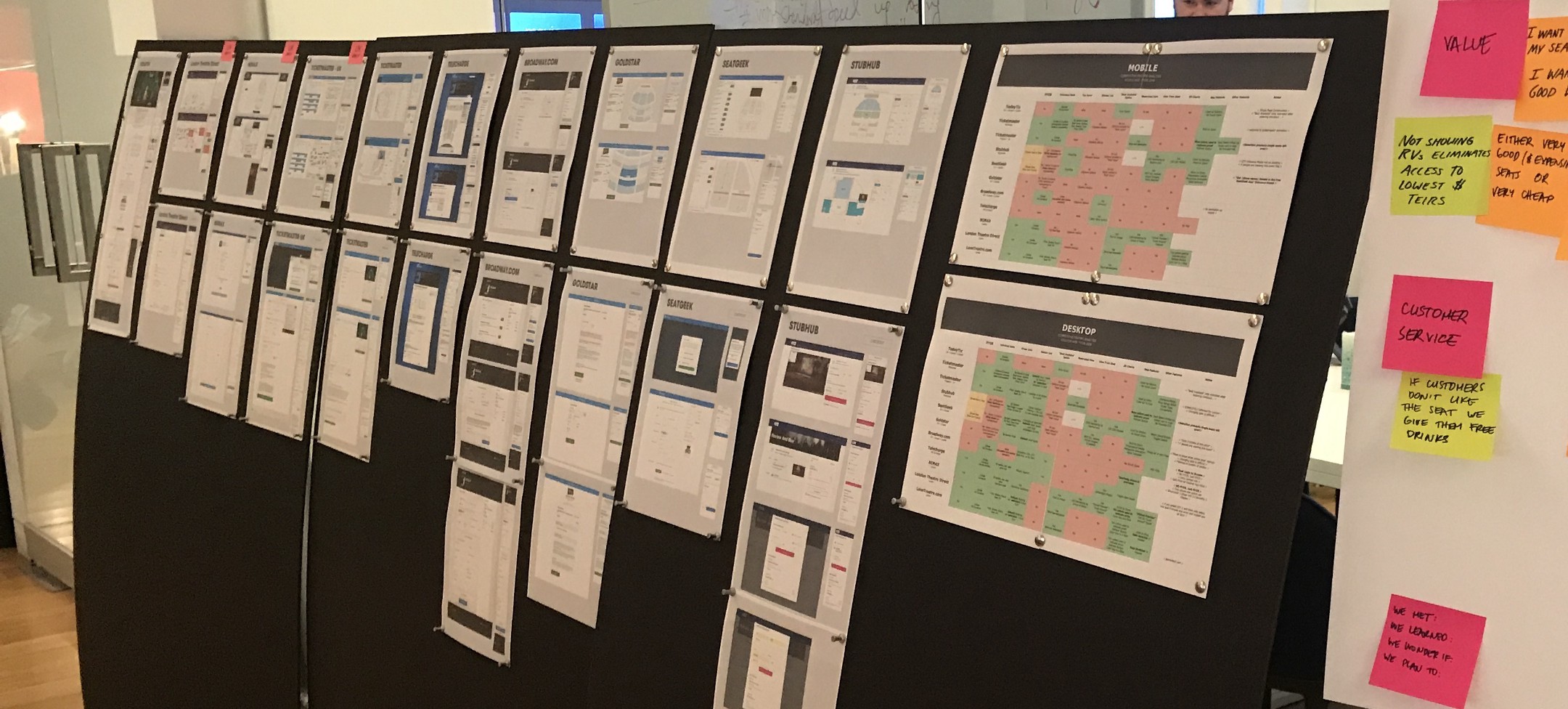
The goal of all this analysis was never to copy the features we saw in our competitors but to understand what they were doing and why they were doing it; to take stock and then improve upon the current industry-standard experience.
My Findings
There was a ton learned throughout this process but among the most impactful were:
-
Accommodating seats and sections
I sat down with engineers and PMs that knew our system best and they brought me up to speed on how our current system works. Beyond these initial meetings, I set up a recurring meeting between design and engineering leadership to discuss implementation and feasibility as we designed and iterated. -
Restricted view is critical
Because theaters tend to be older buildings, the interiors of many houses include columns and other architectural features which obscure the stage. It is critical for theaters to be able to sell these seats and critical for users purchasing these seats to know precisely what they are buying (often at a discounted rate). -
No orphaned seats
In ticketing, an orphaned seat is a single available seat surrounded by taken seats. Because it is much more difficult to sell an orphaned seat, theaters rely on their ticketing agents and ticketing platforms to ensure the fewest orphaned seats possible. If we can't deliver this feature, theaters will never give access to their seating charts.
Ideation
Taking everything we have learned thus far into account we developed three goals to guide our design process:
-
Make decisions easy
Giving users more choice is only a good thing if you also give them the information that makes those choices navigable and actionable. -
Lightweight but scalable
We knew given the tight timeline we would need to deliver a solution that was simple and lightweight. But we also knew this lightweight solution would need to be solid groundwork for a robust, feature-rich flow in the future. -
Communicate value
Now that we better understood what our users might value, we wanted to be clear in how we communicated that value in the interface; in everything from the price bracketing of different seating sections to offering restricted-view seats at a lower price.
Ideation Workshop
With a fast approaching deadline looming we kicked off the design-phase with two cross-department workshops.
Following the format promoted by the Nielsen Norman Group, we brought together coworkers from different departments (2 engineers, 2 account managers, 2 PMs, and 2 designers) four at a time and ran two hour-long ideation sessions, where participants were given a problem statement and asked to ideate, present, critique, and converge.
The ideation workshop was successful on many levels; it produced a ton of valuable ideas (as expected), garnered buy-in from many departments, and sparked important conversations about what we were offering to theaters/users and why it was important. One of the engineers confided in me weeks later that after the workshop he started doing the technical discovery work on his own time because he was so excited.
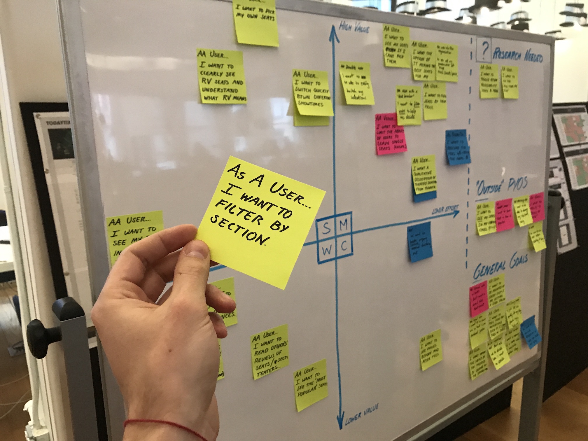
Feature Prioritization
Emerging from the ideation workshop we had a wealth of ideas and needed to synthesize them somehow. In order to determine the order in which ideas/features should be developed further, we needed to estimate how valuable each idea/feature could be and also understand the level of difficulty to implement. Those estimates would guide us towards what to pursue first and what to put back on the shelf.
Using a simple feature prioritization matrix, we made an estimation of user and business value, and then with the engineering team we made an estimation of implementation effort. The resulting mapping, although not precise or final, gave us a great sense for which ideas to explore in the design phase and gave the engineers a good sense of what work they were likely to see in the build-phase.
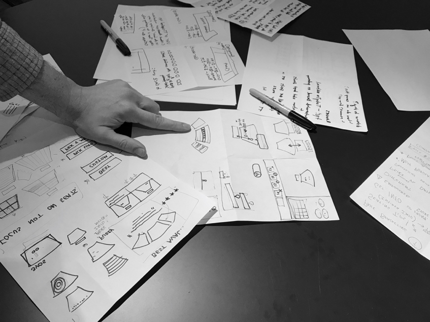
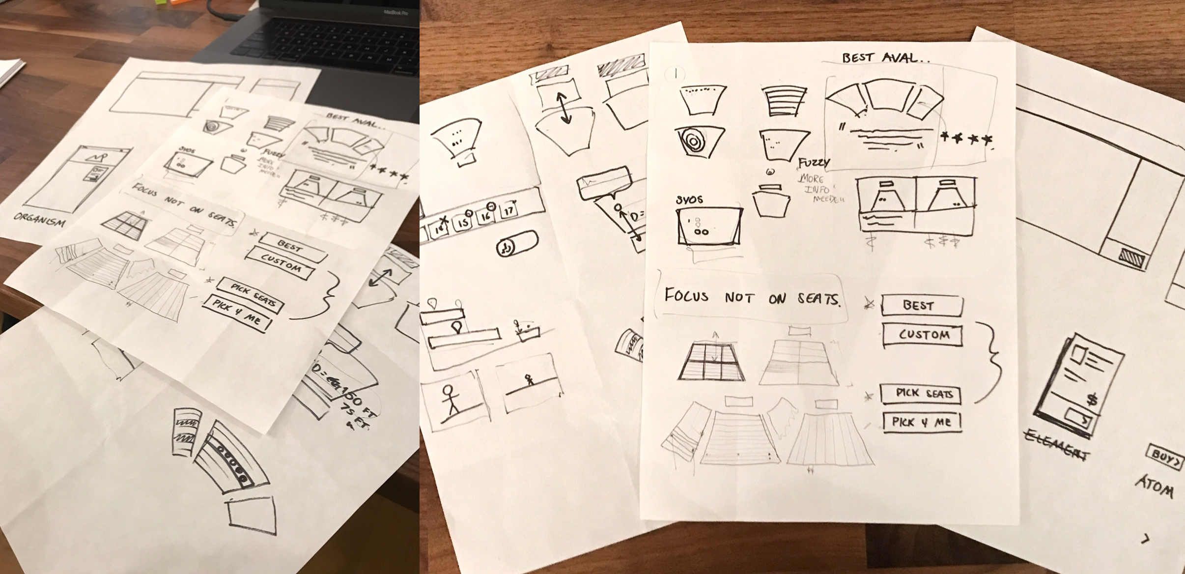
Sketching as Vetting
Using that mapping as a launching point and our design goals as a north star, Ivan and I spent hours sketching on paper before moving into Sketch. Using pen and paper as a constraint, prevented us from getting too far into the weeds and allowed us to explore, discuss, vet, and iterate on many more concepts, features, and ideas. During this time, we frequently pulled engineers into our make-shift war room to discuss feasibility and technical details.
Design
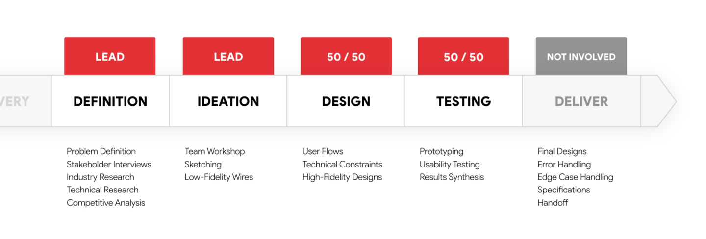
By the time we moved from sketching to Sketch-ing, our designs were already well shaped. Ivan took the lead on iOS and I took the lead on responsive web. As we designed, we took care to check in daily to ensure our designs weren't diverging too much. When possible we would build on each other's good ideas and collaborate on points of improvements. Throughout we talked about how each design could be prototyped and began drafting the tasks we would use to test them in our forthcoming usability testing.
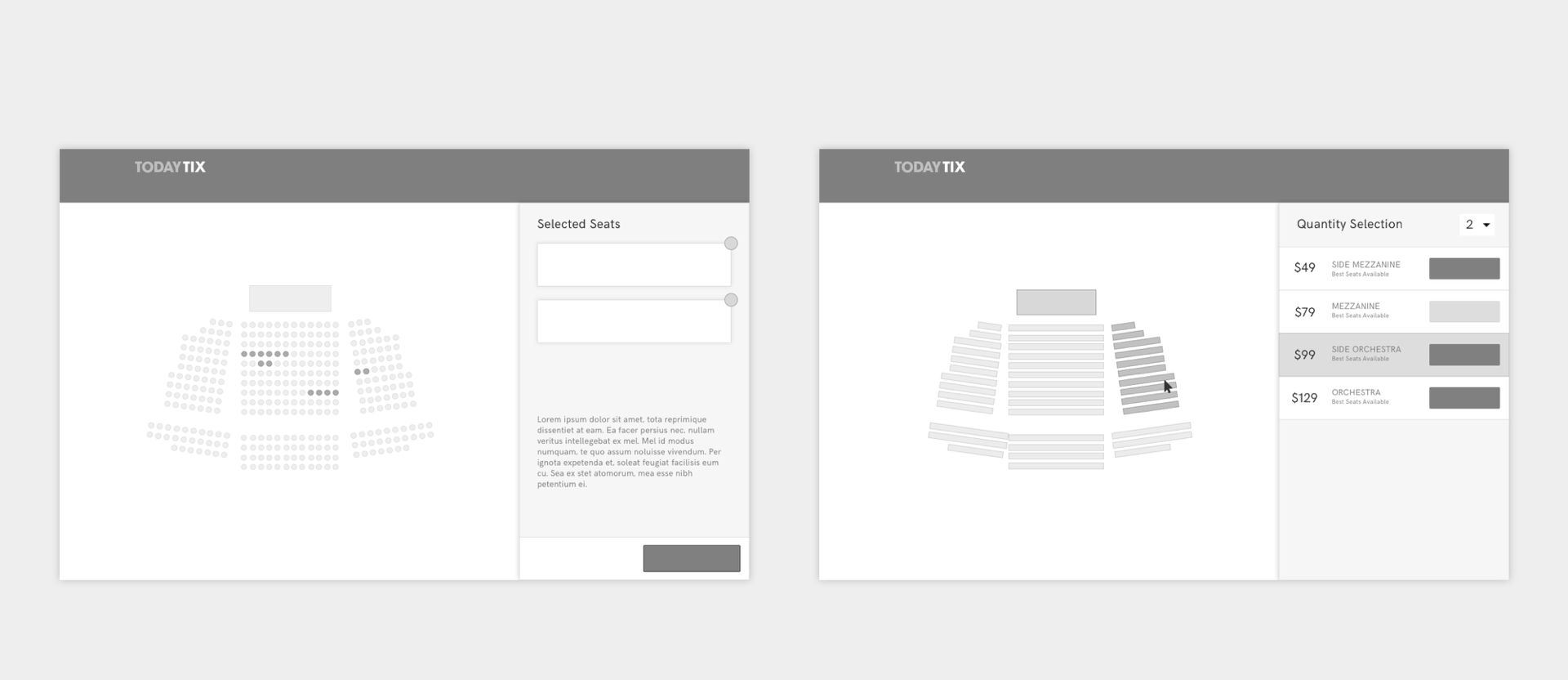
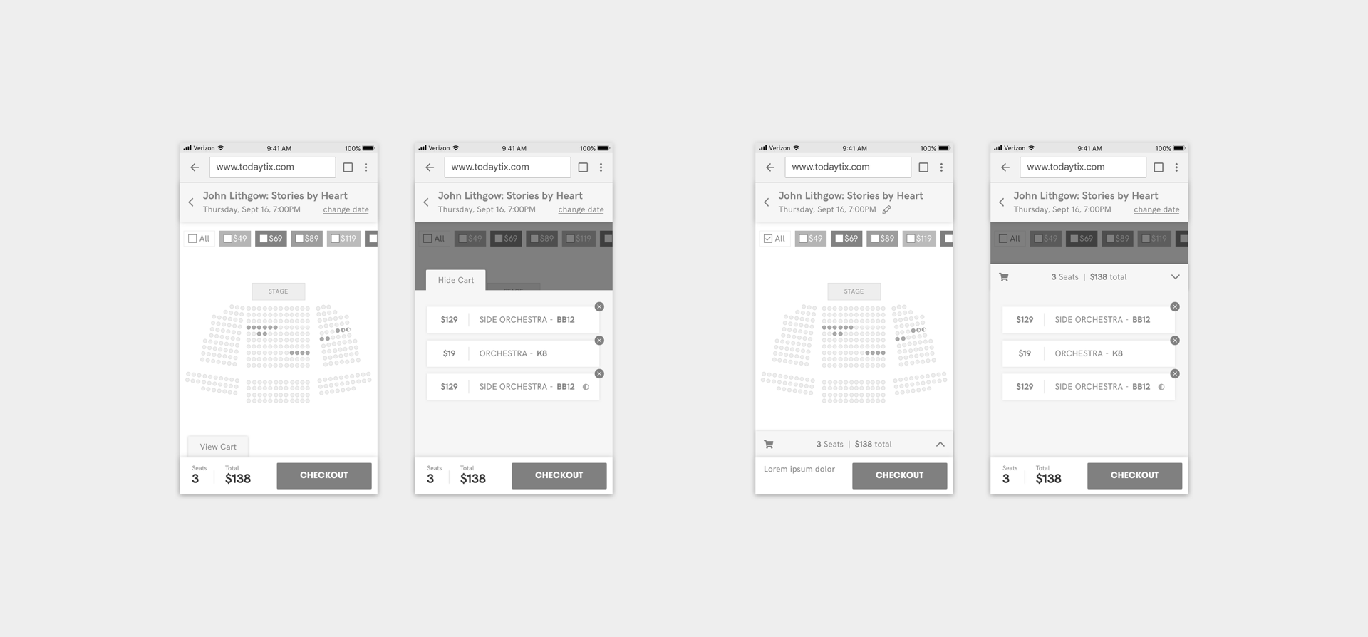
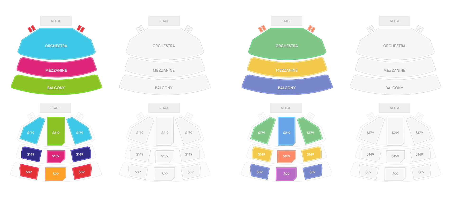
Accommodating Seats & Sections
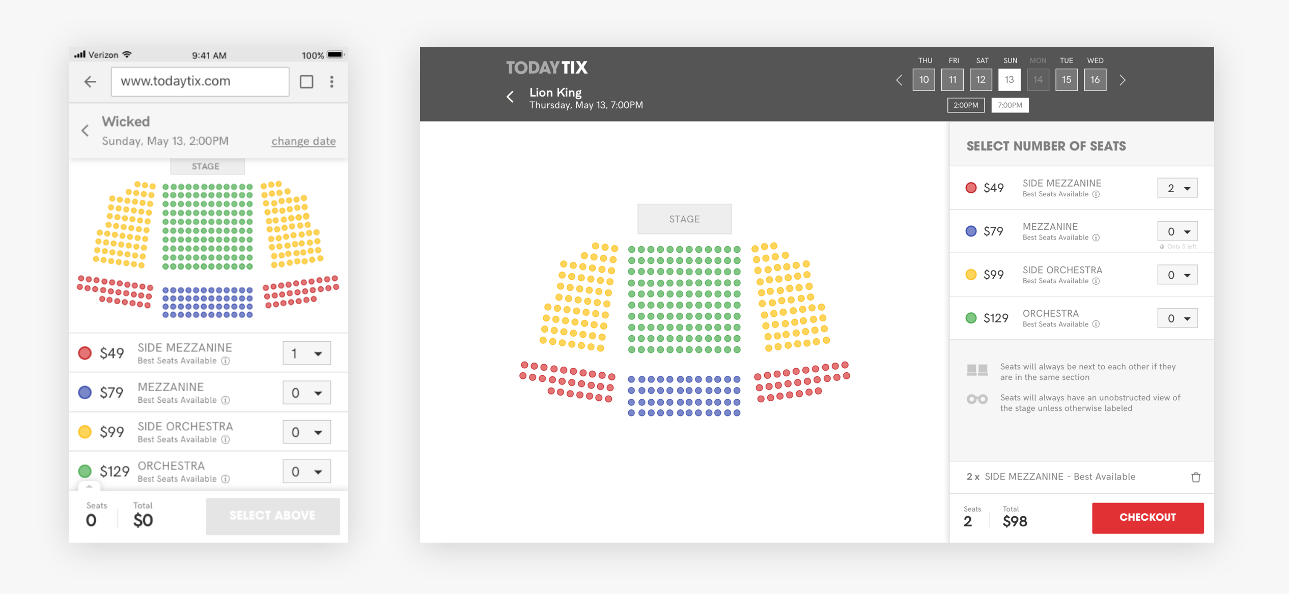
We knew from industry research that our interface would need to accommodate both the selection of specific seats and, if specific seating information wasn't available, the selection of a quantity of seats from generalized sections (orchestra, mezzanine, etc.) After a few iterations we settled on a sidebar design that functioned as a cart when selecting particular seats and a menu of options when selecting a seating section. Depending on the theater and show, users would only see one design or the other but the form of the page would remain consistent.
Responsive
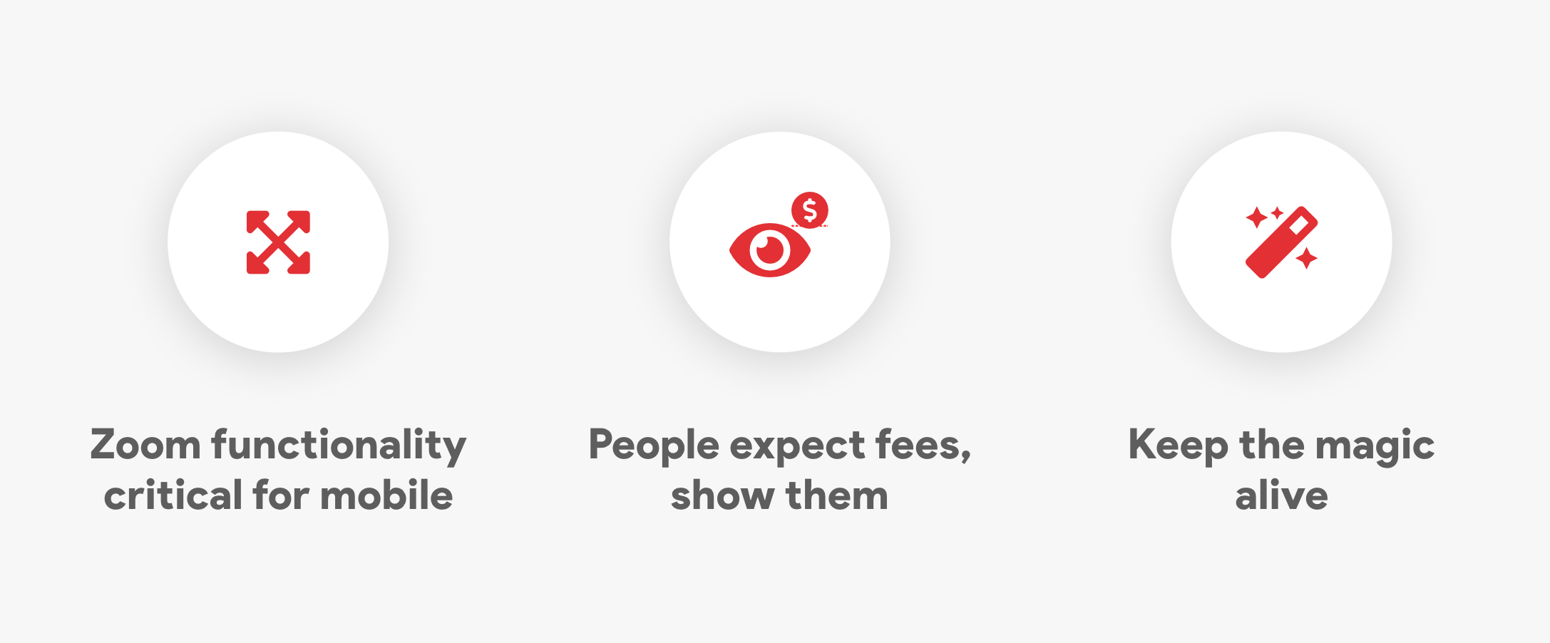
A quick glance at our mobile web traffic numbers told us our design would need to be fully functional at any browser width. By collapsing the date-picker and repositioning the filters we were able to keep many of the elements consistent across any screen size.
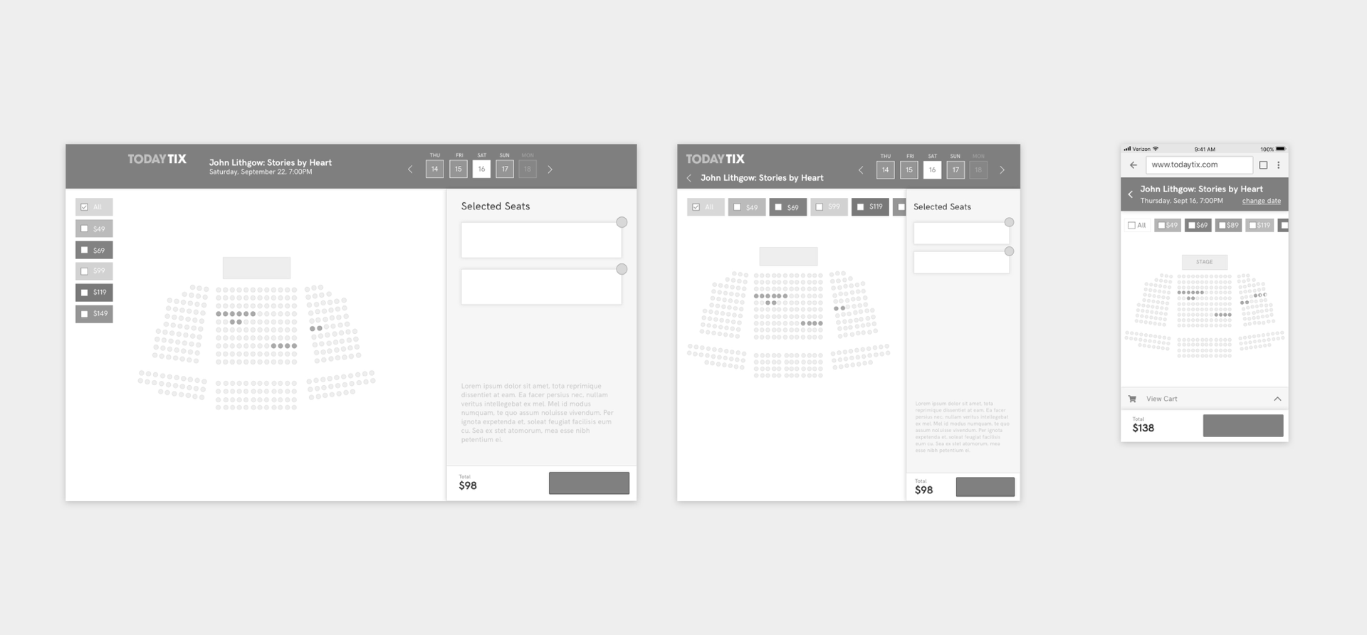
The sidebar section mentioned above collapses into a sticky drawer that slides out to reveal either your selected seats in a cart state or if specific seats are not available, your options for sections and quantity.
Restricted View Seats
Because theaters tend to be older buildings, the interiors of many houses include columns and other architectural features which obscure the stage. It is critical for theaters to be able to sell these seats and critical for users purchasing these seats to know precisely what they are buying (often at a discounted rate).
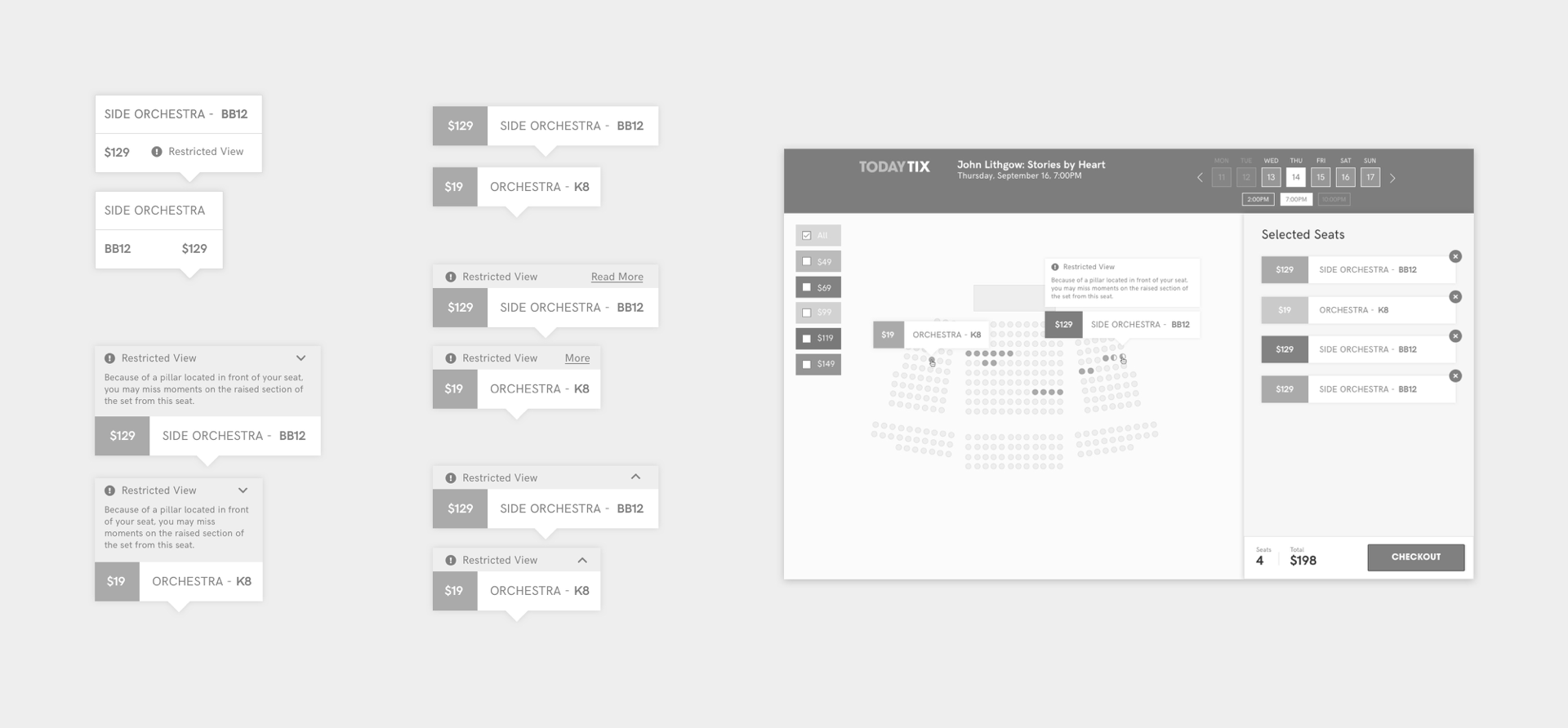
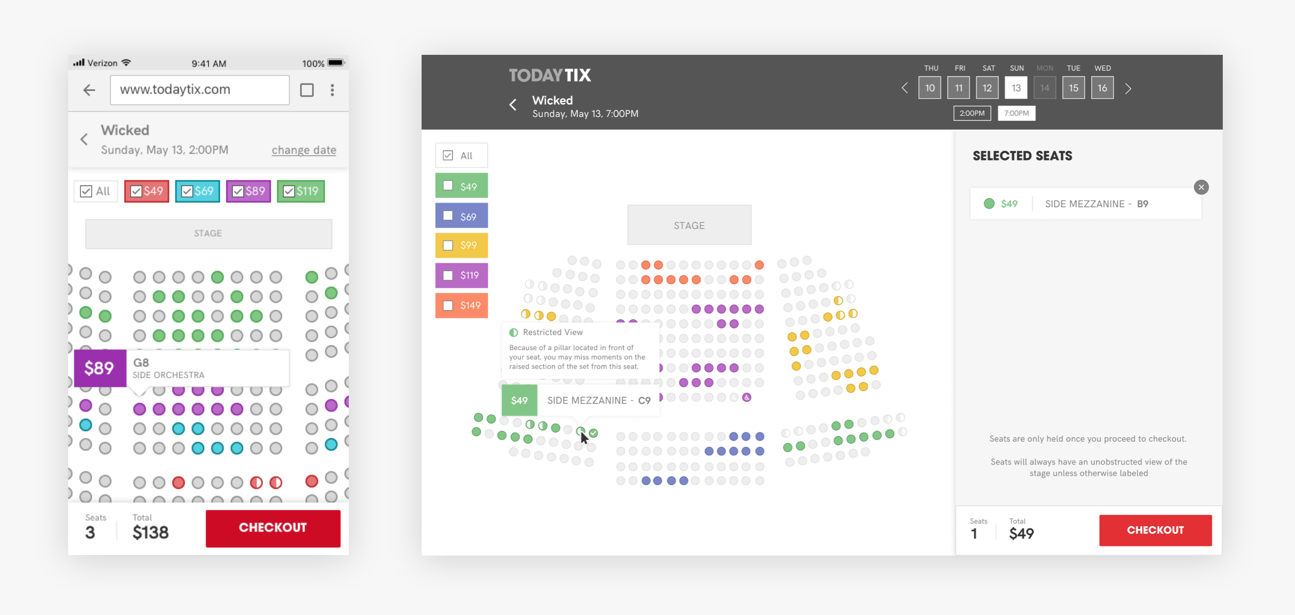
We utilized a tool-tip style hover state on desktop to communicate the details of a particular seat. When the seat is a restricted-view seat we would denote that with a "half circle" shape on the seating map and when hovered over a restricted-view notification would appear alongside the other seating information. If added to your cart, this information would persist in the cart and in checkout so that users never unknowingly buy a restricted-view seat.
On mobile, since hover states can't be utilized, a two-tap system was utilized. The first tap on a particular seat would bring up the seat details, those seat details would now include a button to add to your cart. We were initially concerned about the usability of this interaction pattern but it proved to be quite easy for participants in our first round of usability testing.
Color
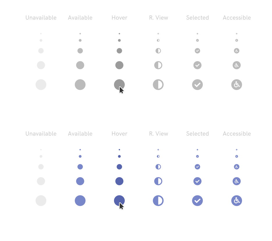
We knew from looking at other ticketing products that using a color scale to denote pricing bands was nearly ubiquitous. We wanted to utilize this familiar pattern but improve on it where it concerned color-blind accessibility. By adding an omni-present set of price filters, color blind users did not need to rely on color to identify at a glance which seat groupings were which price band. Hovering over a filter, the seating chart would display only seats in that price band. Clicking on a filter (checking the box), persisted the hover state allowing users to select multiple price bands if they chose.
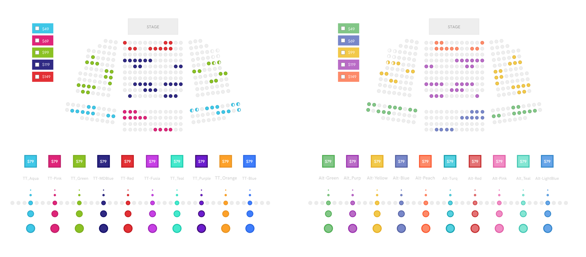
The TodayTix brand color palette was a small collection of neon colors more suited to "pop" on a billboard than live all together in a single digital interface. Still, we wanted to be sure that we couldn't use an expanded set of neons before utilizing a new color scale. So we developed two expanded color palettes and tested them; one that expanded on the TodayTix neons and one that used a more neutral set of generic colors. After our usability testing sessions with users (detailed below) we gave them a direct comparison (seen below) and just asked them which color palette they preferred. Somewhat unsatisfyingly, after our 16 usability tests, the palettes tied seven to seven with two users having no opinion. ¯\_(ツ)_/¯
Prototyping
To validate our designs we would need to test them - and to test them we would need functioning prototypes. Because the system would need to function for both paradigms, 'seat-picking' and 'section-picking', and work on both desktop and mobile devices, we would need a total of four Principle prototypes. Ivan tackled mobile, I took desktop. As participants completed their assigned task of purchasing tickets, each flow would begin on a particular show page and bring each participant through seat selection and checkout. By dry-run testing the prototypes with our colleagues and fixing bugs ahead of time we were able to ensure the prototypes worked smoothly during testing.
Usability Testing
2 days. 16 users. 4 prototypes. 30 tests.
Testing Goals
Our general goal in conducting usability testing was to gain valuable, actionable insights on the usability and utility of our proposed solution. But more specifically we sought to:
-
Validate structural decisions.
In this first round of testing, since this was an entirely new flow, the most important decisions to validate were the high-level, structural decisions; smaller interactions issues could be adjusted in future iterations. -
Identify usability issues.
Identify confusion, misunderstandings, and pain-points of users as they use each prototype. Explore in real time why they are having issues without disrupting the flow of the test too much. -
Better understand user motivations.
Up until this point we understood our users' motivations only through secondhand focus groups. While we had real users in our study we wanted to ask them more about their motivation in picking a seat and more broadly about their theatergoing experience.
Process
Because we did not have any researchers or research resources at the time, I led the planning and execution of the usability testing drawing on the previous experience.
Using UserInterviews.com we recruited 20 participants for a live, two-day study. Participants were not demographically screened but were broadly representative of the TodayTix user base. Each participant was scheduled for a half-hour block of testing time and was compensated for their participation at industry standard rates.
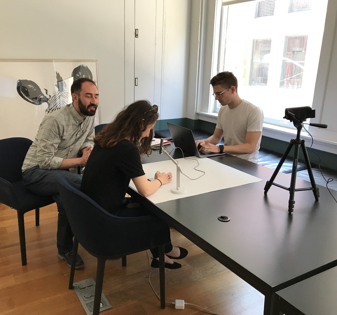
Each participant was led into the testing area and made comfortable before given a standard introduction to testing and testers. Each participant was then asked a short list of questions to better understand them and specifically their theatergoing behavior. Each participant then tested two of the four prototypes: one mobile and one desktop, one PYO-seat and one PYO-section. We alternated which prototype each participant tested first to mitigate any cross-contamination effects. For each test, participants were given the same prototype and the same task to complete. As they completed their task, we asked them to speak out-loud about their experience and asked questions where it seemed valuable.
"You're interested in seeing the 8pm showing of the Lion King this Thursday but you don't want to spend too much. Find an aisle seat for less than $60 and buy that ticket."
At the end of each test we took the opportunity to ask participants for a subjective opinion about the two color-set options and made note of their preference.
Analysis
We emerged from the study with over 15 hours of raw footage. To make synthesizing this data easier, we created a patent-pending framework called the Decathlon Analysis.
The Decathlon Analysis seeks to give researchers a bird's eye view of a study's results by mapping each step in the prototype flow on the x-axis and each participant on the y-axis. By going through each participant's testing footage and making a color-coded note, you quickly see patterns emerge. If a row has a lot of red, that means that particular participant struggled with many of the steps and thus, could be an outlier. BUT if a column has a lot of red, that means that most/all of participants struggled with a particular portion of the prototype, indicating it needs improvement. Yes this takes a while, but once complete the studies results are clear and easily illustrated to stakeholders.
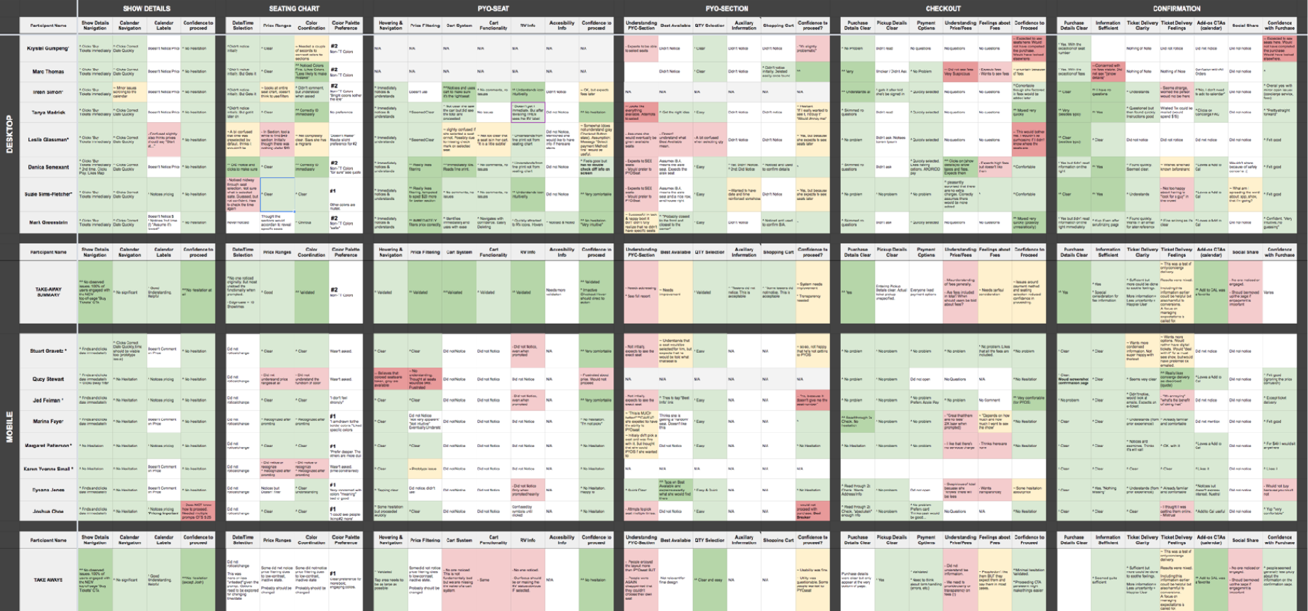
Findings
At a high-level the results could be summarized quite simply:
The seat-picking prototypes worked really well, the section-picking prototypes did not.
In the seat-picking prototypes (on both mobile and desktop) all of our users were able to complete their assigned task. Level of effort and level of satisfaction varied a little but all were relatively satisfied and confident they could use the system. Color coordination, hover states, cart system and quantity selection performed especially well.
In the section-picking prototypes (on both mobile and desktop) most, but not all users were able to complete their assigned task. Levels of understanding and satisfaction were markedly lower than in the seat-picking prototypes. In hindsight, one of blunders seemed especially bad:
By illustrating seating charts with individual seats (rather than block sections), we had created the expectation of seat choice and couldn't follow through.
Other insights
Takeaways
What I learned
-
Involve tech early and often.
The engagement with engineers throughout this project proved to be some of the most fruitful and informative. As designers we better understood the technical constraints and as engineers they better understood what we were trying to deliver, what shape it might take and why. We each learned, taught, and ultimately made the product better while making each other better. -
Leaving projects before completion sucks.
Although leaving TodayTix to join ClassPass was the right decision, it was still difficult to leave this project and the team before it was finished. Nonetheless, I was immensely proud to see this project finished by the team at TodayTix. -
Great design ideas don't always come from designers.
I learned this lesson twice during this project. First, when I conducted our cross-department ideation workshop, when I was truly blown away by the creativity/insight of my colleagues. And second, when we asked participants in our usability study what they would do to improve the seat-picking experience.
What I would do next
Although I did not get to see this project through to deployment, I know exactly what I would have done next:
-
Fix the identified issues.
First and foremost, we learned a ton from our first round of usability testing and I never got the chance to properly iterate on those designs and fix those issues before testing again. -
Address edge-case and error handling.
Although we did spend time anticipating errors and edge-cases in our initial prototypes, there was a lot more to do on this front before those designs were ready to build. Once a design is ready, I take pride in making sure the experience will be great even if things go wrong. -
Build with real data and real seating charts.
Our prototypes were built with a lookalike seating chart meant to represent an average, mid-size theater with mid-level of availability. But to be sure the design works properly, I would love to use real seating charts with real availability data.
Thanks for reading :)