Empathy in the Conversion Funnel
ClassPass | Q4 2018
Overview
The Situation
When I joined ClassPass in 2018, our plan for growth was ambitious and we were at risk of missing our EOY acquisition numbers. In a surge effort, I was moved to the newly formed, aptly named, Growth Squad inside our product org. There was an appetite in product and marketing alike, to see if the same user-centric principles which had improved our products, could improve our conversion funnel and help us hit our acquisition targets. Our challenge was simple:
Redesign our primary conversion funnel
to improve the experience for prospective users and
the lift the conversion rate for our business.
The Role
Somewhat atypically, I was the sole contributor working on the project up until the handoff to engineering. I led the discovery phase - assessing the opportunity. I led the research phase - understanding the existing issues. And I led the design phase - redesigning every step in the flow and delivering engineering-ready designs. It is fair to say: this project was my baby.
Despite my ownership of these early phases, this project (like every project) would never have materialized without the work and collaboration of our amazing team of five engineers and one product manager.
The Result
When A/B tested against the current funnel, our redesign of ClassPass path-to-purchase resulted in a 10.2% improvement in purchase CVR. However,
when fully built & launched domestically in March 2019, we saw an incredible +14.2% lift in purchase CVR and a 26.1% increase in lead generation.
And becuase we convert roughly 10% of collected leads, we were able to add another 2.3% to our impact on acqusition. It is difficult to overstate how significant a 16.5% lift in acquisitions is for a company of ClassPass' size.
Discovery
Leading this initial phase of discovery, I gathered current funnel data and past research (UXR & marketing research) to better understand where our current funnel was failing. I then conducted additional, research to better understand how it could be improved.
Although this project was instigated by an squad-level OKR to "increase acquisitions" we internally reframed the business goal with a more user-centric problem statement:
How might we increase acquisitions by improving the experience of our conversion funnel.
Understanding & Analyzing
Past Research and Current Data
Before diving into designs, I wanted to understand as much as I could about our primary conversion funnel.
-
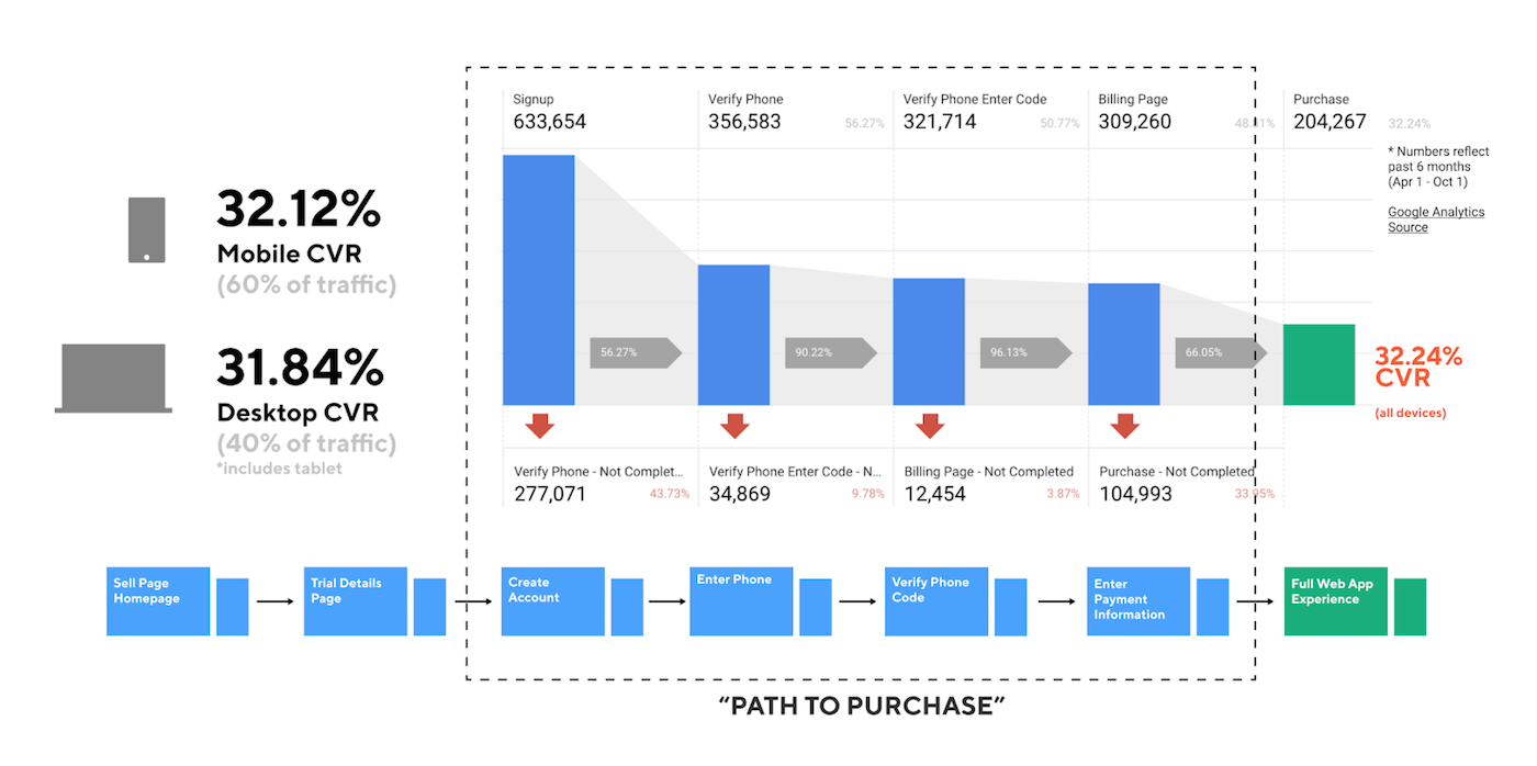
To understand the raw performance of our funnel:
I reached out Isaiah, one of our data analysts, and we put together a visualization of traffic moving through our conversion funnel (shown below). Amazingly this particular visualization did not exist before. -
To internalize any relevant UX research:
I met with our lead UX researcher Key, who gave me four such relevant studies: an onboarding study from Q1 2017, a diary study from Q2 2018, a persona study from Q2 2018, and the preliminary analysis from a massive fitness-journey survey. -
To internalize any relevant marketing research:
I met with Andrew, a marketing analyst, who pointed me to our quarterly marketing surveys, our NPS reports, and a report on "value prop performance" in our 2017 campaigns. -
To understand any known pain points:
I reached out to Erika in our customer experience department, who reviewed common conversion complaints that they hear in CX from both prospects and acquired users. -
And finally, to understand any learnings from previous testing:
I reached out to Nina, who conducts all of our optimizely A/B tests, to get a download of all relevant testing conducted on the current funnel.
These sources of insight were a powerful starting point but there were still significant blind-spots in our understanding.
Conducted Research
To enhance our understanding of the conversion funnel and the people that use it to buy our product we conducted more research:
-
To better understand why our users were abandoning the funnel:
We implemented an "exit survey" powered by Iterate which prompted users leaving the funnel to answer a one question survey about why they were leaving. -
To better understand what the experience is actually like:
We conducted two remote usability tests on UserTesting.com for desktop and mobile funnels.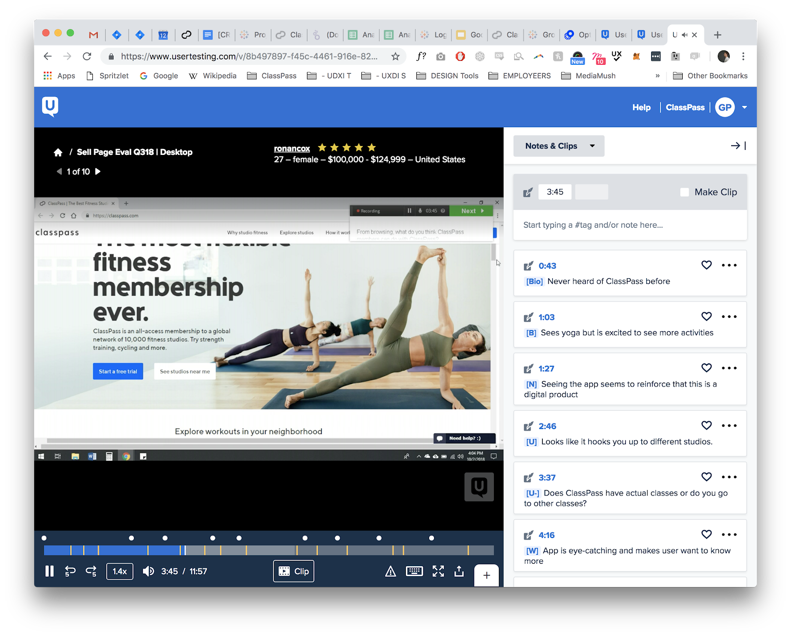
-
To leverage the learnings of other companies:
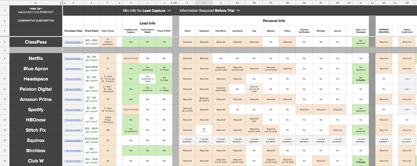
I analyzed 13 major, subscription-based, conversion funnels end-to-end for both desktop and mobile. Included in this effort was a massive comparative feature analysis to see what information was gathered and when it was gathered in each funnel (shown below).
Definition
The sources of insight (both past and present) from phase 1 would prove invaluable to the design process but before we could leverage them, we needed to revisit our assumptions and refine our understanding of the opportunity and the potential impact.
Stakeholder Assumptions
Going into the project we had some core assumptions that were passed down to us from marketing:
-
"There are just too many clicks" | FALSE
This assumption proved easily falsifiable when comparing the minimum number of clicks across other funnels assumed to be highly effective (shown below). One example: Netflix, (which posted incredible growth in Q4 2018) had more clicks (15 vs 17) and more page transitions (8 vs 6). These numbers are visable in the comparative analysis spreadsheet above. -
The less information, the less distraction, the better." | MOSTLY FALSE
This assumption, while true when it comes to reducing distraction down-funnel, was false when it came to information. Users in our remote usability study and our exit intent survey said they would require more information not less in our current funnel.
Proving these assumptions to be false was critical in removing preconceived notions from the team and garnering buy-in from important stakeholders in marketing.
Opportunities
After synthesizing all sources of insight we emerged with 5 general opportunities to guide the redesign process:
-
Heavy Entry Friction
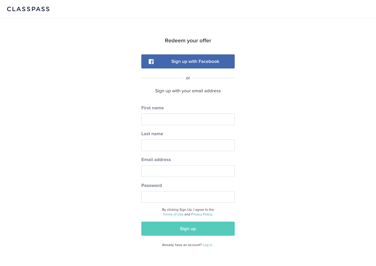
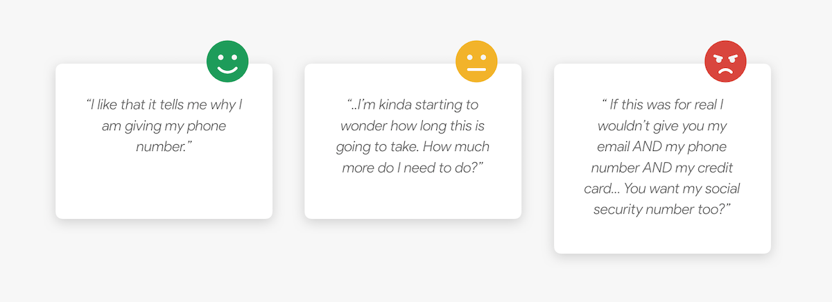
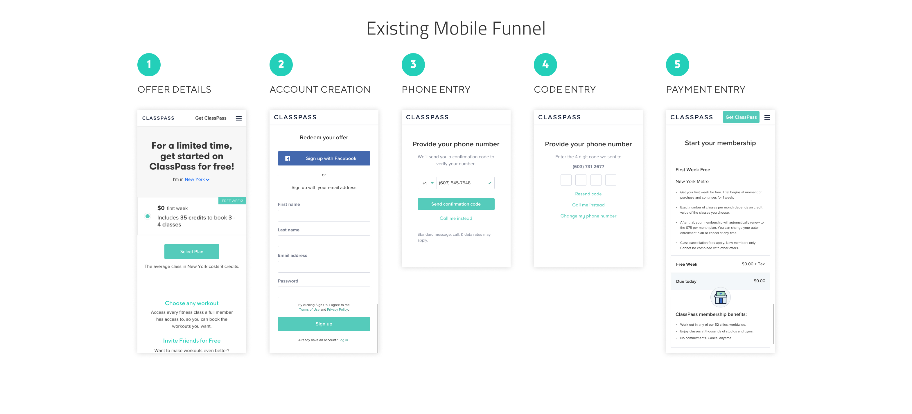
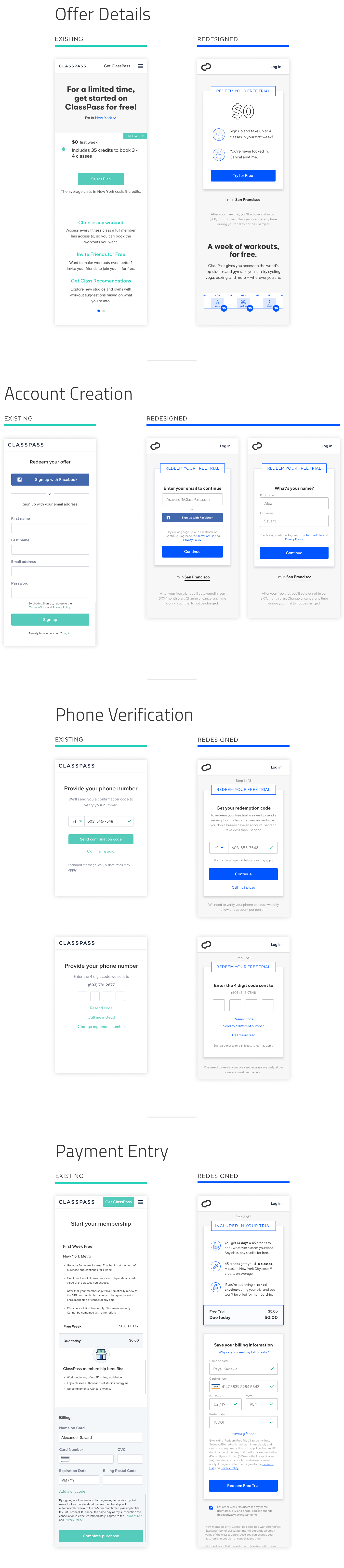
A glaring point of improvement from the start, our existing funnel began with an entire page of contextless, form fields (shown below). To begin the process, users were required to provide: first name, last name, email, and password. In remote usability testing, one user likened it to "filling out a double-sided form" at the DMV. -
Lead with Lead Generation
Leads (the term for a user that has supplied their email) are invaluable in identifying and retargeting users that have a demonstrated interest in your product. ClassPass will eventually convert 10% users who supply us with their email. Although our current funnel did begin with lead generation, it paired it with full account creation (first, last, pass, and email). Unsurprisingly, when curious users were forced to give all their information at step one, 44% of them chose to bounce giving us zero information. -
Users Understand it's not "Free"
In the past, ClassPass had diminished information about trial auto-renewal from prospective users because they suspected the auto-renewal terms and price tag were scaring people away. In addition to being ethically questionable, this practice appeared to be backfiring. Watching users in the remote usability testing, it was clear that users intuit the trial is not "free" as advertised and when they can't find the pricing information they grow skeptical of the offer and suspicious of ClassPass. Summing up this sentiment, one user said, "the fact that you're not telling me the price makes me think it's astronomically expensive…" -
Lacking Context
Users feel most comfortable when they understand what is going on and why. By providing more context on where they are ("Step 2 of 3"), what exactly is required ("enter your phone number"), why it is required ("so we can verify your account"), and how they stand to benefit ("to unlock your free trial"), users will feel more comfortable giving personal information and proceeding. Additionally, the fewer (jarring) context switching between screens the better. -
Lacking Motivating Incentives
Presumably, all users enter the funnel because they're interested in our product or our free trial. By reminding them at every step of what they stand to gain by continuing, we can ensure more users opt to continue.
Bias for Action
In a disheartening turn of events, the project was deprioritized on our roadmap. True to ClassPass' operating principle of being "biased towards action", I continued to work on the project in my spare time. The resulting redesign, when presented to stakeholders, was reprioritized and moved to the top of our roadmap.
Getting a Red Light
Our discovery and research efforts culminated in a readout to key stakeholders inside the product and marketing departments. Outlined at the end of the deck was a conservative impact projection that I put together with my PM and proposed next steps for taking action on the insights. In a subsequent meeting with our product director, we were notified that although leadership saw some potential in the redesign, they did not think it was capable of achieving our estimate impact.
The project was going to be put on hold indefinitely so that we could focus on other lower hanging fruit. Using our data and research, I pleaded a case for moving forward (proposing an expedited timeline and a simplified process) but ultimately the decision was made to focus our efforts elsewhere.
A Bias for Action
Despite the decision to deprioritize, I still believed overhauling the conversion funnel could move the needle. I discussed the project with our Head of UX, Mike Morales. Convinced that if our stakeholders could actually see the redesigned funnel, they would recognize the potential I saw, Mike encouraged me to continue the design process on the side of my other work and to deliver a V1 that could be reviewed by our stakeholders.
Redesign
Drawing on our base of research and data, I redesigned every step in our primary conversion funnel on web.
Guiding Principles
-
Focus on People, Not Numbers
The world of conversion rate optimization (CRO) has a necessary obsession with numbers. But all too often, this macro-focus on analytics and acronyms reduces converting users to numbers and causes us to forget they are real people. By empathizing with those people, by remembering the needs, wants, and worries observed in our user testing, I suspected we could build a much better experience and ultimately a better performing funnel. -
Create a Platform for Experimentation
Understanding that we would need to experiment and iterate relentlessly on our funnel to truly optimize it, I sought to design a more flexible, more scalable funnel in which content could be easily changed for experimentation. -
Reduce Steps & Transitions
Although much of the information we collected in our funnel was vital, some of it was not. I met with our engineering team to discuss what information could be removed from our funnel without causing issues. Along with removing unnecessary information collection, I sought to keep transitions between screens to a minimum. -
More Transparency
In addition, to being more ethical, I suspected that providing more transparency into our terms and our pricing would lead to more trust and ultimately more conversions. We saw from our user testing that our users know nothing is "free" and found honest, up-front pricing information refreshing.
The Redesign
-
Lowering the Barrier to Entry
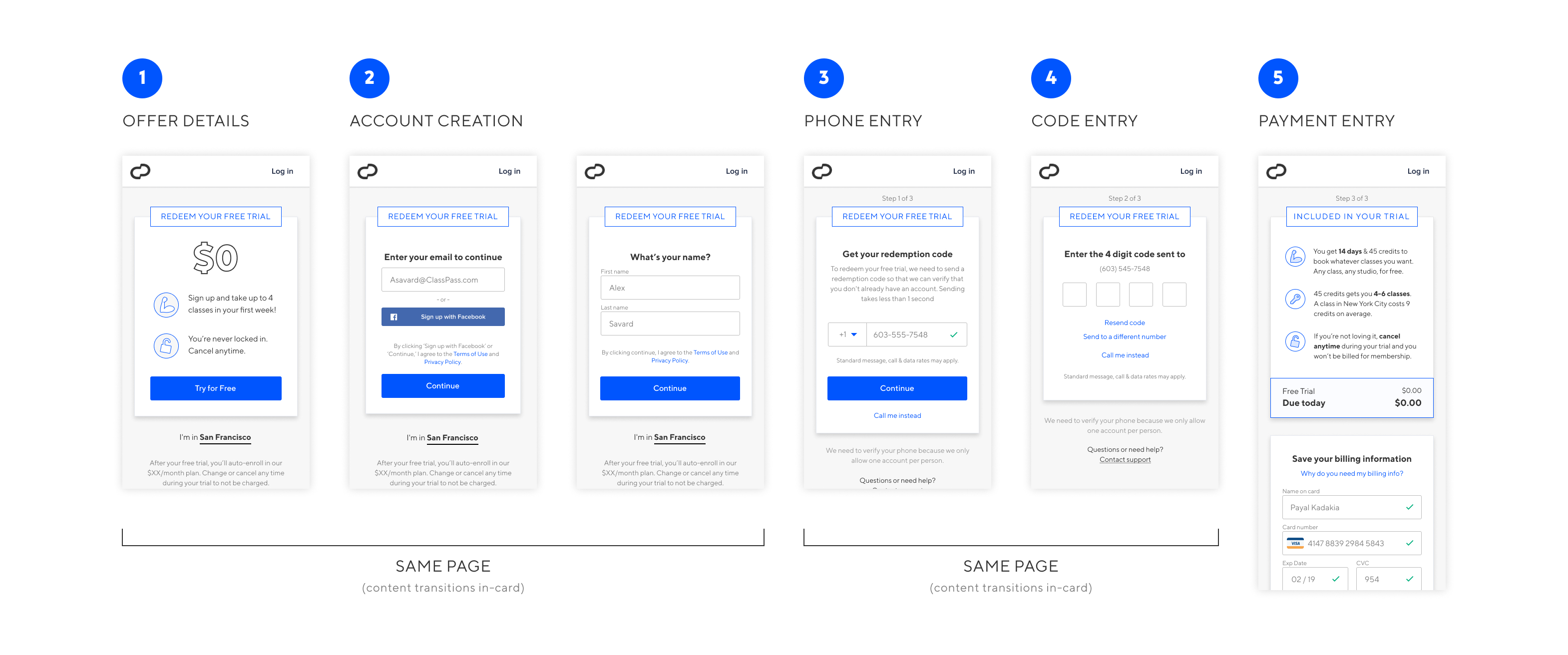
In our old funnel, curious users entering the funnel were immediately dropped into a context-less, full page form field where they were required to fill in their first name, last name, email, and password. In our redesigned funnel, users entering the funnel remain on the trail details page (in context), and are prompted for only their email to continue. This simplified account creation flow is presented inside the same "Redeem your Trial" card where they initially clicked using a simple sliding transition.
-
Visual Context Consistency
Our old funnel lacked any real visual consistency, creating a subtly disjointed experience. In our redesigned funnel, each point of interaction (form fields/CTAs) throughout the entire flow exists within a single card style, with an omnipresent title that is both directive and motivating: "Redeem your Free Trial".
-
More Information & More Incentive in Copy
Users feel most comfortable when they understand what is going on and why. By providing more context on where they are ("Step 2 of 3"), what exactly is required ("enter your phone number"), why it is required ("so we can verify your account"), and how they stand to benefit ("to unlock your free trial"), users will ultimately feel more comfortable giving personal information and continuing. By reminding them at every step of what they stand to gain by continuing "Redeem you Free Trial", we can ensure more users opt to continue. -
True Transparency
We saw in our user research that our prospects wanted more straightforward information, particularly where it concerned pricing. To tackle this head on we built out a new modal which explains exactly why we collect payment information and exactly what they can expect in their trial.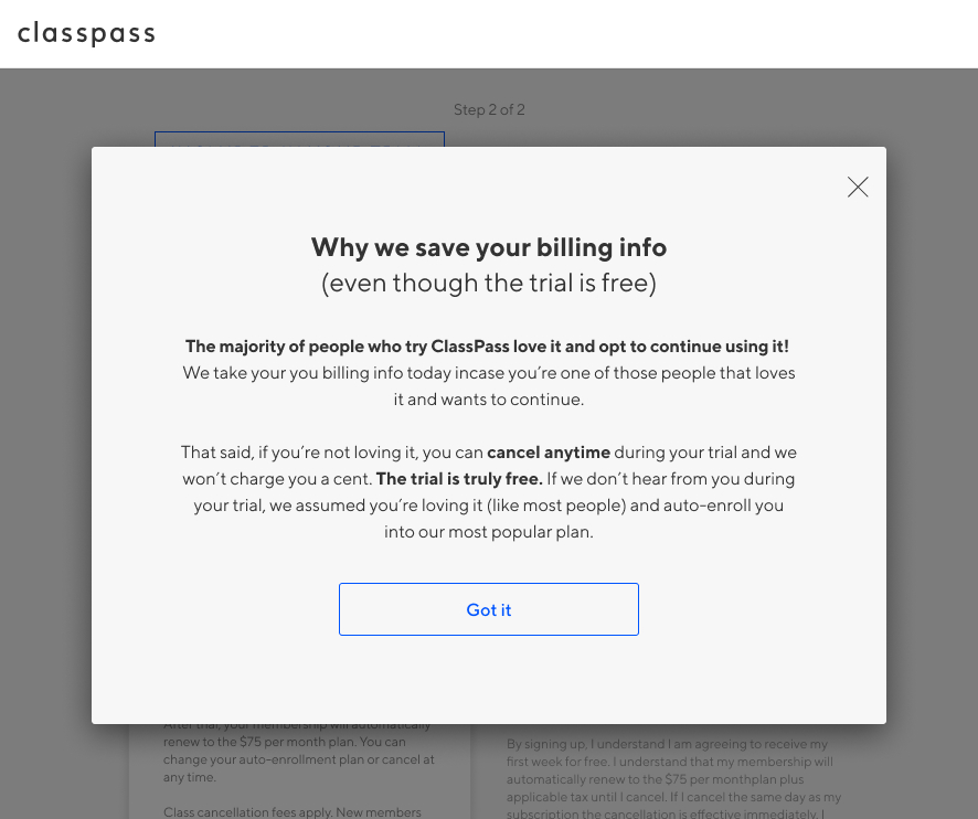
Before & After - Mobile
Results
After seeing the redesigned funnel, product leadership was so bullish on the impact they requested we forgo usability testing with a prototype and "build the damn thing" so we could begin A/B testing. Subsequent A/B testing showed a 10% increase in purchase CVR. When rolled out nation-wide in April the redesigned proved to be a 14% increase in purchase CVR and a XX% increase in lead generation.
A/B Testing Results
A/B Test #1
Although I was working full time on another squad, word quickly spread throughout the product org about the much anticipated redesign test. The top-line was heartbreaking:
-3.34% lift in purchase CVR @ 14% stat significance
Investigation and Iteration
Dismayed by the results, I logged into Optimizely to investigate what might be causing the issue. Digging deeper into the results, I segmented by device and found an interesting discrepancy. The final step exit rate (payment collection) showed a 4% decrease on desktop but an 8% increase on mobile. Quickly comparing the mobile redesign to the control my blunder was obvious. In an effort to keep the CTA 'above the fold' I had inadvertently buried the most important information at the bottom of the page. To simplify the issue, in the old mobile design the page was structured: 1) "$0 due today", 2) "please enter payment info". In my new designs it had been reversed: 1) "please enter payment info" 2) "$0 due today". Users needed reminding that they would not be charged today before they were willing to enter their payment info. I gathered the working team, made my case to reverse the order of the modules, and restart the A/B test. They saw the same potential and agreed.
A/B Test #2
Two weeks later, when the test reached 80% statistical significance it was clear that my theory was correct. The exit rate on mobile improved by 12% and the affect on the top-line result was astonishing:
+10.27% lift in purchase CVR @ 82% stat significance
{Control-CVR 9.84%. New-CVR 10.85%}
Real World Results
Eager to see if the improvement observed in the A/B test would translate to the real world, the growth squad worked with our analytics team to track our CVR in the weeks to follow. Because of seasonality in the fitness industry, we would expect to see slight decrease in CVR between March and April (~1%). Instead, we have witnessed a:
+14.2% lift in purchase CVR from March to April 2019
And becuase we convert roughly 10% of collected leads, we were able to add another 2.3% to our impact on acqusition. It is difficult to overstate how significant a 16.6% lift in acquisitions is for a company of ClassPass' size.
Takeaways
What I Learned
-
Focus on People, not Numbers (this bears repeating)
The world of conversion rate optimization (CRO) has a necessary obsession with numbers. But all too often, this macro-focus on analytics and acronyms reduces converting users to numbers and causes us to forget they are real people. By empathizing with those people, by remembering the needs, wants, and worries, it is much easier to ultimately move the numbers. -
A Little Iteration Can Go a Long Way
The small iteration we made after our first round of A/B testing (reversing the module order) resulted in a +13% swing in purchase CVR. That's crazy. We talk a lot in product about "quick iteration leading to outsized impact" but witnessing it first hand was a powerful reminder of the power of iteration and the power of design to generate significant impact. -
Empathy is Good Everywhere
Regardless of whether you are designing for a current user or a prospective user, they are still a human being with wants, needs, and worries. Empathy works everywhere (especially in marketing and conversion funnels) because at the end of the day it is a human experience.
What I Would do Next
Although I am no longer working with the growth, I can think of a couple things I would do next. I recommended the following before leaving:
-
Audit the Entire Conversion Journey
Look at the funnel end-to-end and understand how we can improve entry into our funnel (from different marketing channels) and improve entry into our product once they have left the funnel (after conversion). The same strategies that made the purchase experience better could be applied to other segments of the experience and ultimately get more people into the funnel and reduce trial-churn once people have converted. -
More Vetting on Password Removal
Because of my tight design timeline I did not get to properly vet, understand, or ideate on the password removal. Lucky for us the system appears to have worked great (with only 1 CX outreach during testing) but there is certainly more to explore. -
Iterate to Maximize Gains
Dig deeper into the data and conduct usability testing on the current build to figure out how to maximize the gains we saw in V1 as we move to V2. We do not know how much optimization is left and thus I think it would be very worth exploring.
Thanks for reading :)